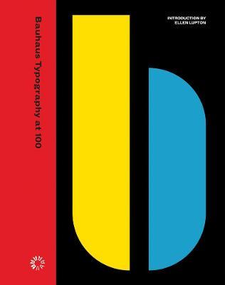
Bauhaus Typography at 100

Bauhaus Typography at 100
An unprecedented, definitive look at the school's typography and print design, from its early expressive tendencies to the functional modernism for which it is famed today
The Bauhaus looms large as one of the most influential legacies in 20th-century graphic design. Known for its bold sans-serif typefaces, crisp asymmetrical grids and clean use of negative space, the school emerged as the forebearer of a new look--one that seized the tools of mass production in the creation of a radical new art. Today, just over 100 years after the Bauhaus's opening in 1919, the school's visual hallmarks have come to define modernity as it appears on the printed page.
The official catalog for Letterform Archive's inaugural gallery exhibition, Bauhaus Typography at 100 explores the school's legacy in graphic and typographic design through artifacts of its own making--its books, magazines, course materials, product catalogs, stationery, promotional fliers and other ephemera. From the book's beautifully designed pages, readers learn of typographic masters László Moholy-Nagy, Herbert Bayer and Joost Schmidt, who channeled Constructivism's geometric forms and optimism for industry into printed vehicles for the school's teachings. Here is where Bauhaus typography--its rejection of serifs and capitals, embrace of experimental alphabets, insistence on universal clarity, and innovation in layering and hierarchy--took its distinctive shape. The catalog also shines light on the Bauhaus's lesser-known early forays into expressive lettering and illustration, also tracing the school's immediate impact on seminal design movements such as the New Typography and, of course, on design practitioners working today. Lavishly illustrated, carefully researched and written, and accompanied by an in-depth introduction from noted Bauhaus expert, author and curator Ellen Lupton, Bauhaus Typography at 100 is a must-have for any fan of modern design.PRP: 279.00 Lei
Acesta este Prețul Recomandat de Producător. Prețul de vânzare al produsului este afișat mai jos.
251.10Lei
251.10Lei
279.00 LeiLivrare in 2-4 saptamani
Descrierea produsului
An unprecedented, definitive look at the school's typography and print design, from its early expressive tendencies to the functional modernism for which it is famed today
The Bauhaus looms large as one of the most influential legacies in 20th-century graphic design. Known for its bold sans-serif typefaces, crisp asymmetrical grids and clean use of negative space, the school emerged as the forebearer of a new look--one that seized the tools of mass production in the creation of a radical new art. Today, just over 100 years after the Bauhaus's opening in 1919, the school's visual hallmarks have come to define modernity as it appears on the printed page.
The official catalog for Letterform Archive's inaugural gallery exhibition, Bauhaus Typography at 100 explores the school's legacy in graphic and typographic design through artifacts of its own making--its books, magazines, course materials, product catalogs, stationery, promotional fliers and other ephemera. From the book's beautifully designed pages, readers learn of typographic masters László Moholy-Nagy, Herbert Bayer and Joost Schmidt, who channeled Constructivism's geometric forms and optimism for industry into printed vehicles for the school's teachings. Here is where Bauhaus typography--its rejection of serifs and capitals, embrace of experimental alphabets, insistence on universal clarity, and innovation in layering and hierarchy--took its distinctive shape. The catalog also shines light on the Bauhaus's lesser-known early forays into expressive lettering and illustration, also tracing the school's immediate impact on seminal design movements such as the New Typography and, of course, on design practitioners working today. Lavishly illustrated, carefully researched and written, and accompanied by an in-depth introduction from noted Bauhaus expert, author and curator Ellen Lupton, Bauhaus Typography at 100 is a must-have for any fan of modern design.Detaliile produsului


